Source: US Stock Research Society
Author: Daniel Jones
The outlook is certainly not as bad as some people are worried about.
As 2024 is about to end and 2025 is approaching, it is not a bad idea to take stock of the year and contemplate the situation for next year. In fact, 2024 has been an incredibly bullish year for the market. As for 2025, investors can focus on some positive aspects. The outlook is certainly not as bad as some may fear. Meanwhile, there are some weaknesses in the economy that could worsen. Nevertheless, based on all available data, analysts will remain optimistic.
 As of the time of writing this article, $S&P 500 Index (.SPX.US)$ it has risen an astonishing 25.1% year to date. As long as there are no major unexpected events in the next two weeks, we should expect the market to essentially maintain the status quo. Considering the historical average ROI of the market ranges between 11% and 12%, it can be said that 2024 has been a sensational year. The decline in interest rates has proven to be positive. But in fact, this situation has occurred during a period when the economy has performed fairly well in most aspects, which certainly helps to drive up stock prices.
Nowadays, AI and its related fields are being hyped up. This includes companies focusing on their own large language learning models, companies in the datacenter market, companies focusing on semiconductors, and so on. However, this does not mean that every part of the economy is performing excellently. This is not a fair way to describe the situation. There are still some weaknesses in the economy. The overall Real Estate market has finally started to recover. However, considering the time and funds required to build houses, there will always be a lag effect here.
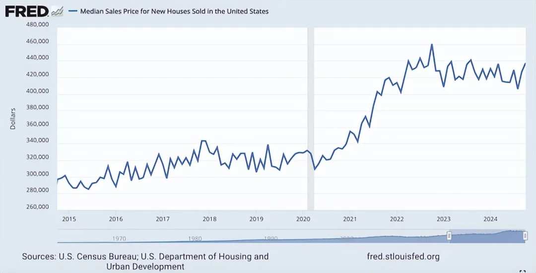
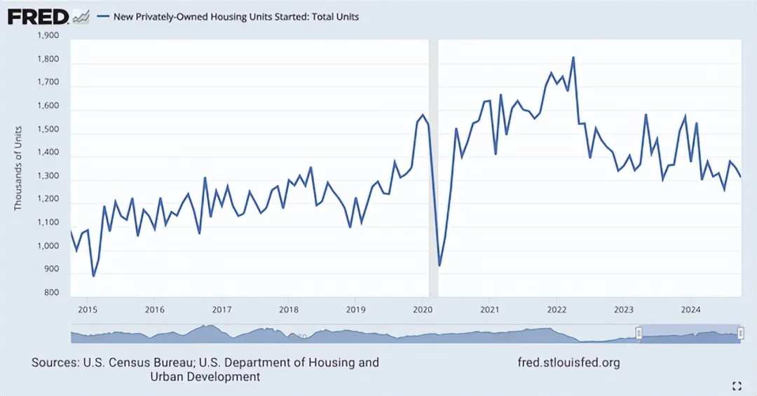
Due to high interest rates and inflationary pressures, housing prices surged after 2020. In February 2020, before a short-term decline, new home prices peaked at an average of $331,800. By October 2022, home prices peaked at $460,300. However, since then, we've seen prices start to decline. For most of those two years, home prices remained within a fairly narrow range. But as of October this year, which is the latest data available, the average selling price of new homes in the USA was $437,300. At the same time, the number of new housing starts has significantly declined. In October of this year, the total number of privately-owned new housing starts decreased by 17.4% compared to the same period in 2021. It dropped by 9% compared to the same period in 2022.
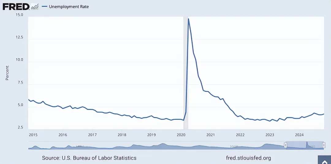
There are other weak spots as well. For instance, the unemployment rate has rebounded from its lows. Last year, the unemployment rate hit a historic low of 3.4%. However, around August 2023, we began to see that number rise. In fact, the rise in interest rates has had its expected effect, weakening the labor market. As of November this year, the unemployment rate has risen to 4.2%. Despite this being a disappointing trend, it is worth noting that it remains lower than almost any other period in this country's history. Therefore, by this standard, our labor market does indeed remain exceptionally strong.
Some may argue that this obscures certain data and that the labor participation rate is a more appropriate metric to measure the situation. Indeed, while this number has risen since bottoming out in 2020, it is still below its previous levels. But not by much.
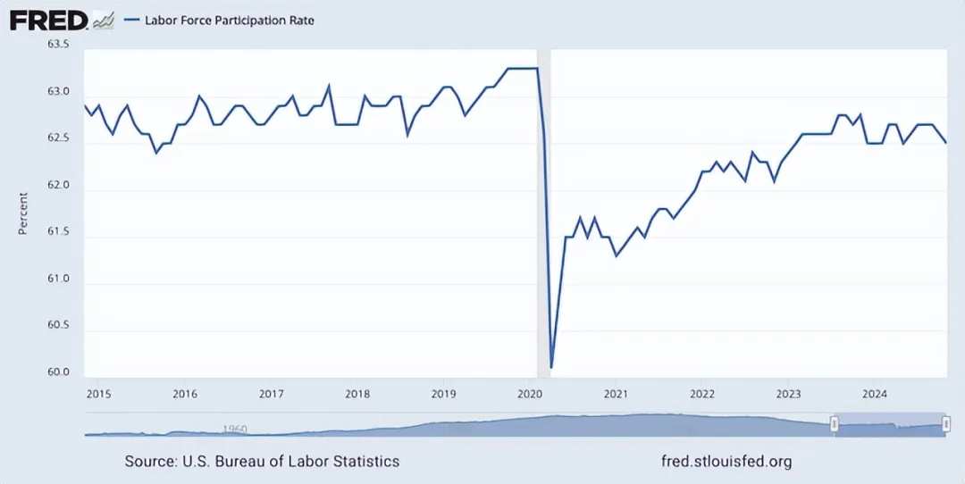
In November this year, the labor participation rate stood at 62.5%. In contrast, prior to reaching its nadir, this figure was 63.3%. With the aging population in the USA, the labor participation rate could decline further in the long term. Therefore, due to demographic changes, this is not an ideal metric.
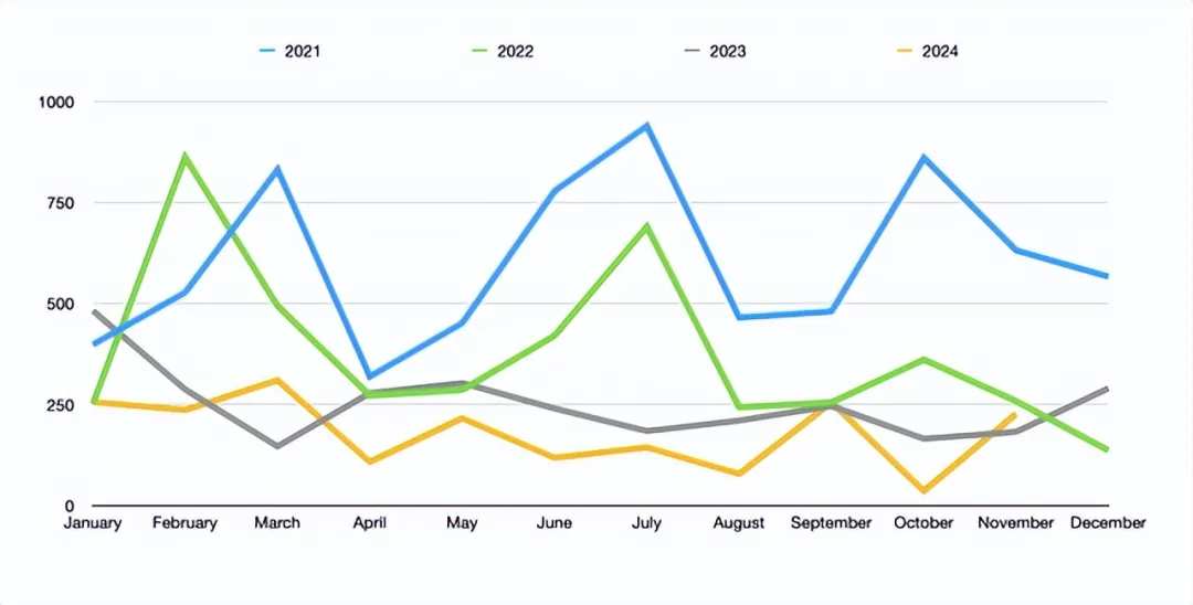
Although the unemployment rate remains low, there are some signs of weakness in the labor market. In the chart above, you can see the monthly job creation numbers for this year to date. This displays how many jobs were created month over month and compares the data from the first eleven months of this year to those of 2021, 2022, and 2023. It indicates that the data for 2024 indeed shows job creation lower than any of the previous three years.
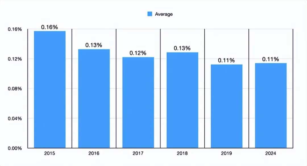
Another thing that the Analysts decided to do was to create the above chart. In it, you can see the average monthly job creation numbers for 2024 compared to the five years prior to 2020. The 0.11% we are seeing now is the same as the level seen in 2019. It is also lower than in any other year covered by the chart. I would never say this is a flashing red indicator. In fact, this discrepancy is likely due to the unemployment rate being so low that, even if things go well, further job creation may be challenging. That said, this indicator is worth keeping an eye on.
Other data is somewhat mixed. An article published by consulting giant McKinsey earlier this month pointed out that consumer confidence in the USA seems to be rising. However, their description of this data is even somewhat odd. They noted that by November this year, 47% of consumers were optimistic about the economy. This is the highest optimism rate in years. In fact, one would have to go back to before the pandemic to see such a shift. But their data also showed some other interesting results.
Despite consumers being more optimistic, their spending has decreased compared to last year. What I mean is that they are choosing lower-priced Commodities, delaying purchases, or taking other actions to save money in order to get better value from their purchases, which was not the case a year ago. This proportion has decreased from 76% to 74%. Overall, consumers also plan to have a relatively muted holiday season. Additionally, compared to last year, the percentage of respondents planning to spend big during this holiday has decreased by 3%. Among them, the youngest generation reduced by 11%, and the Baby Boomers decreased by 4%. Even high-income earners expect to spend 10% less than last year's holidays.
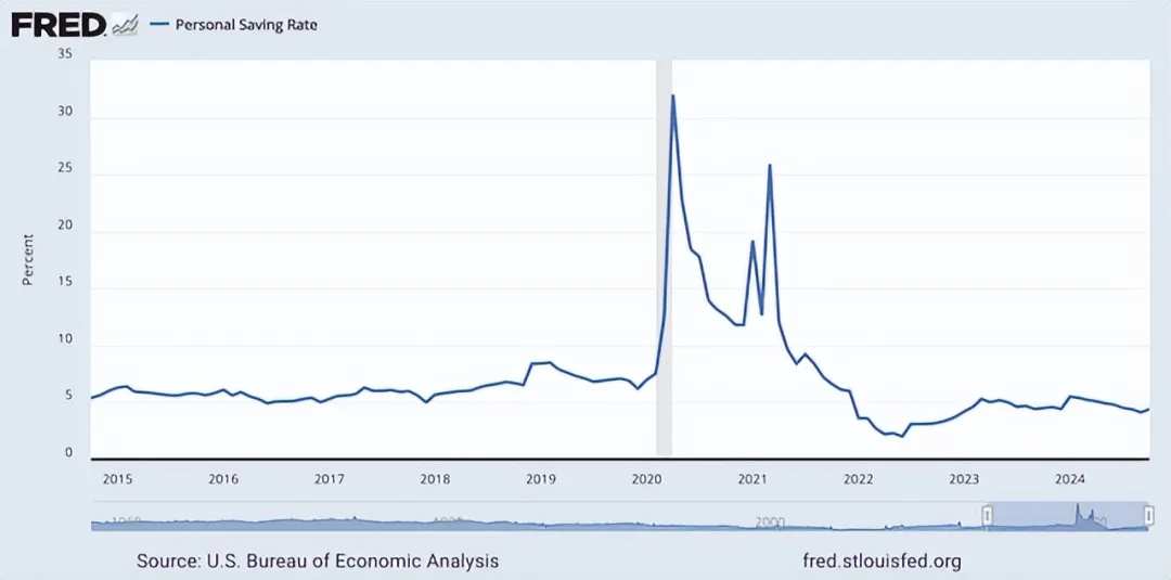
At first glance, most of these data points look terrible. However, there are also some positive signs. Although costs have been rising over the past few years, personal savings rates have improved. Currently at 4.4%, it is still lower than the 6% to 7% range seen in most years before the pandemic. However, this figure has increased significantly compared to the 2% low reached in June 2022.
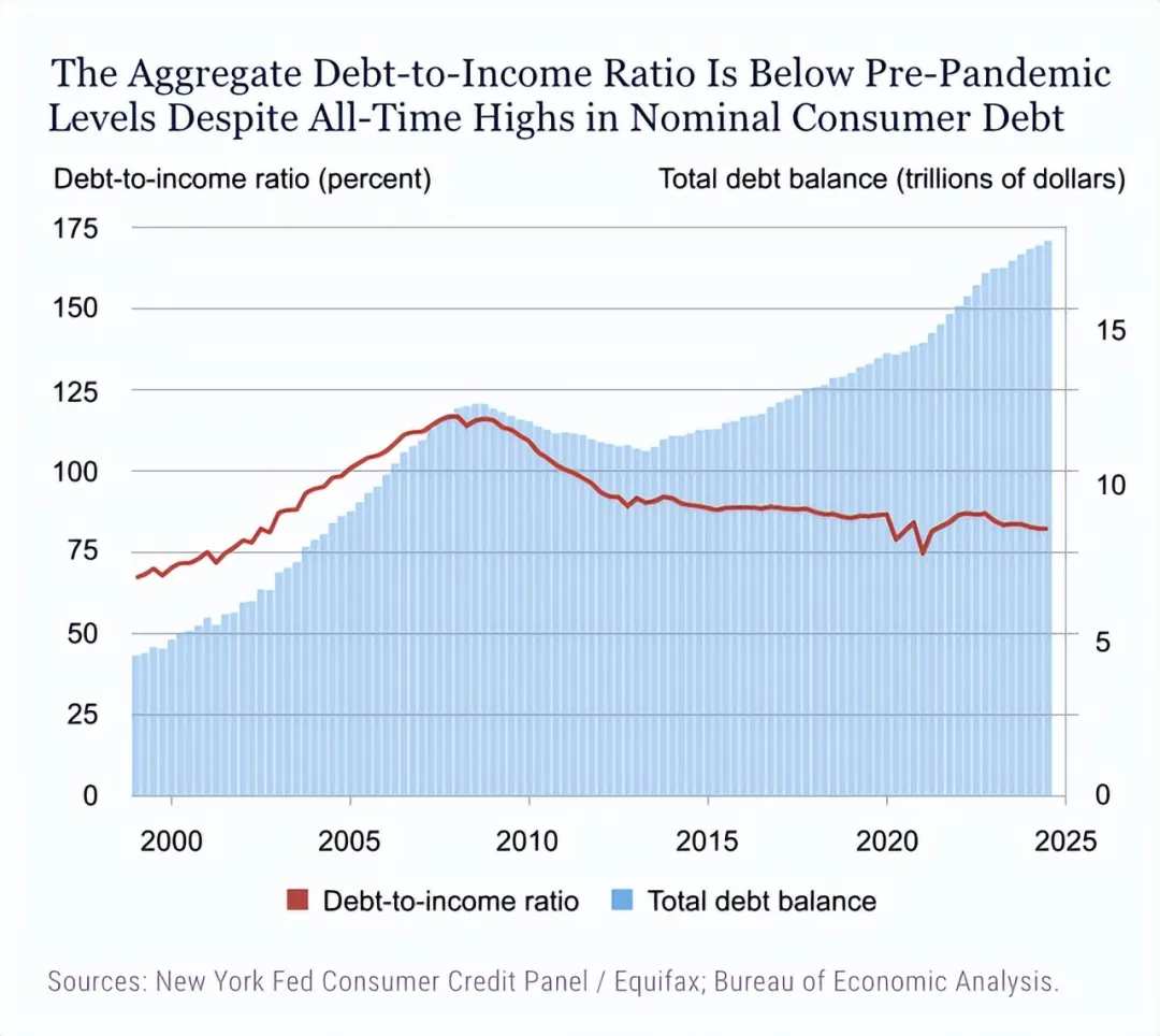
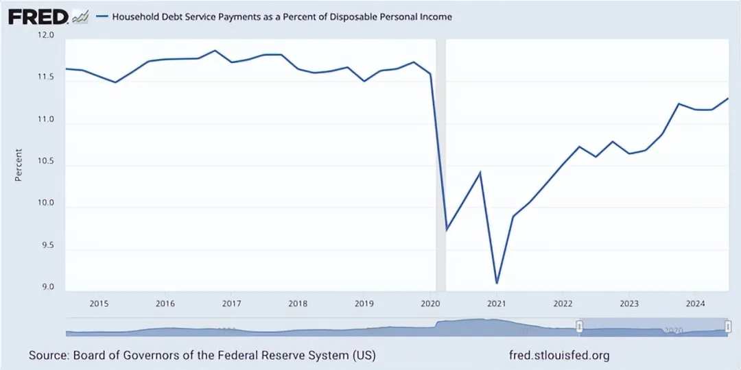
In addition to the increasing personal savings rate since its low a few years ago, the debt-to-income ratio is also decreasing. This can be seen in the chart above. Essentially, although the value of debt has risen in recent years, income has been growing faster than the value of debt. This is certainly a net Bullish sign, as shown in the chart below, where household debt repayment expenditures are below pre-pandemic levels. However, if the current trend continues, household debt repayment expenditures are certainly on the rise and may exceed pre-pandemic levels.
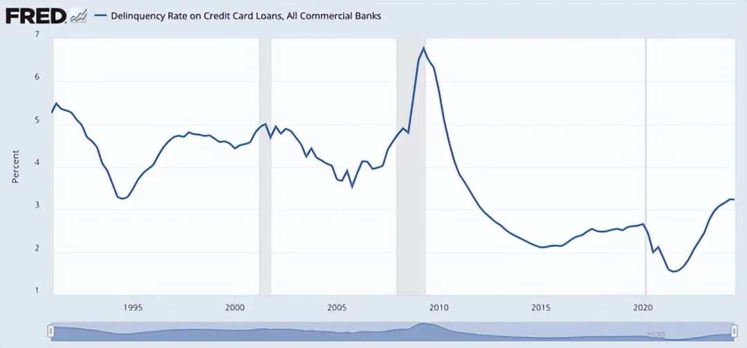
It is worth noting that credit card delinquency rates have soared in recent years, reaching 3.23%. However, this is lower than any period during the 20 years leading up to the Great Recession (including the Great Recession itself).
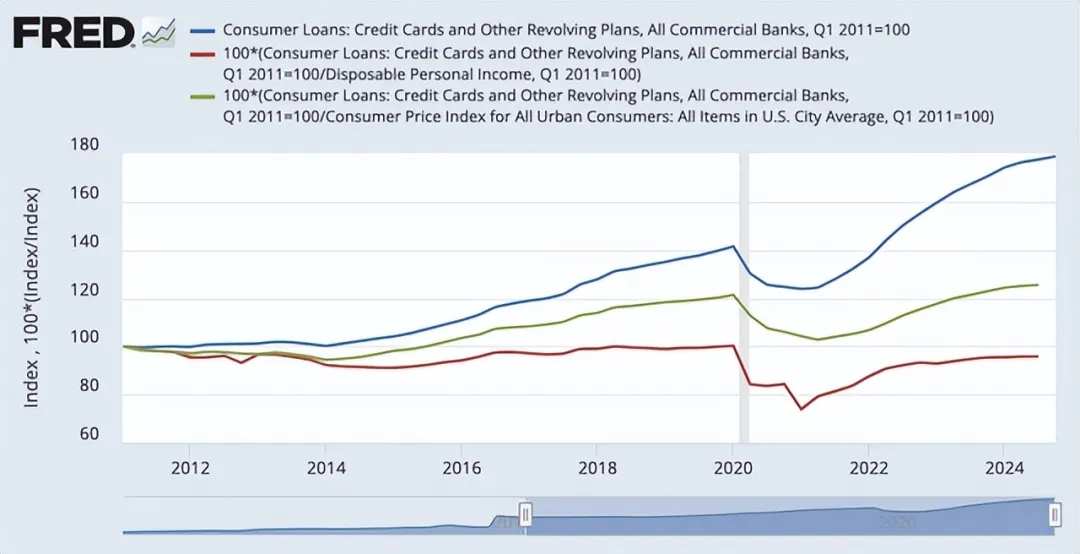
Again, some may point out that this is a net negative. However, everything needs context. In the chart below, you can see three different Indicators that have been indexed for comparison. The red line in this chart is particularly persuasive. It calculates the total amount of consumer loans divided by personal disposable income. Our current level is actually still below the level seen before the COVID-19 pandemic. Therefore, although credit card debt in the USA has surged to an all-time high, even surpassing $1 trillion for the first time last year, personal disposable income is growing at a faster rate.
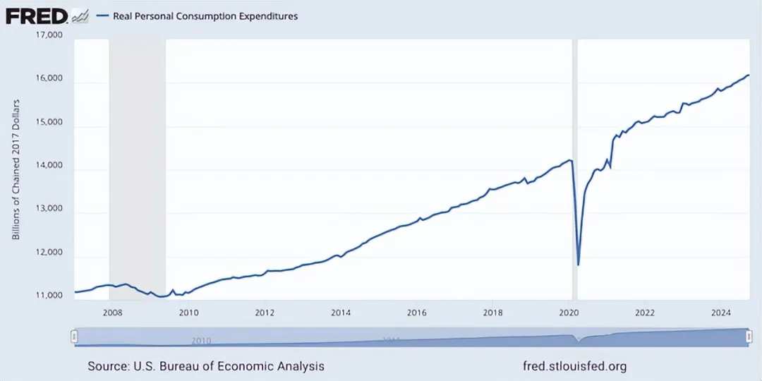
Meanwhile, real personal consumption expenditures have also reached an all-time high. As of October this year, this figure has risen to an annualized $16.18 trillion, which is 3% higher than the $15.71 trillion reported for the same period in 2023. Therefore, despite some weaknesses here, our unemployment rate remains close to historical lows. After adjusting for inflation, the money consumers earn is more than what they owe. While the credit card delinquency rate has been increasing compared to 2020 levels and the savings rate is declining, at least personal savings rates have improved compared to a few years ago. From a net worth perspective, all of this indicates that consumers are stronger.
One issue with actual disposable personal income is that it does not account for the rising costs of living associated with housing, food, and other factors. To address this, we need to examine per capita disposable income. However, Analysts have not been able to find this data. To tackle this issue, an alternative approach has been taken. By utilizing consumer expenditure surveys provided by the Bureau of Labor Statistics, we are able to examine the relationship between consumer expenditures and average income. Unfortunately, the income data provided by the agency is pre-tax income. Nevertheless, Analysts have found a way to address this issue.
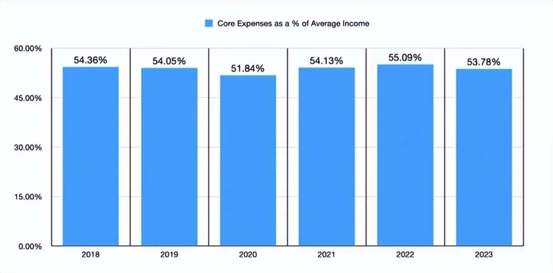
In the chart above, you can see what percentage of the average income provided by the Bureau of Labor Statistics is spent on core costs. These costs include housing, transportation, food, and medical care expenses. While they are not as low as during the peak of the pandemic in 2020, the figure for 2023 is lower than at any time between 2018 and 2022. We do not yet have data for 2024. But this is certainly encouraging. Additionally, as the Federal Reserve pointed out, from 2018 to 2023, real per capita disposable personal income increased by 30.4% when not accounting for inflation. In contrast, the increase in these core costs was 28.1%. Even if we consider the period from 2019 to the present, we would see a 25.3% increase, while these costs have only increased by 22.3%. This is enough to show that while income growth has been slow, it is outpacing the growth of core spending, indicating that the consumer situation has improved.
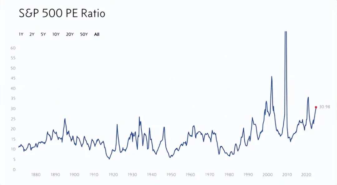
Those who are bearish on the market may rightfully point out that stock valuations are too high. Take two examples. The first involves the PE of the S&P 500 Index. As of the writing of this article, the index stands at 30.98, which if we exclude the late 1990s/early 2000s and the Great Recession, would reach historic highs. These three periods are typically not ones you want to combine. This alone looks frightening.
Another way to observe the market is through the so-called Buffett Indicators. This measures market valuation by taking the total Market Cap of USA stocks divided by USA GDP. According to data from Guru Focus, as of the writing of this article, this ratio is 2.08. This means the value of the stock market is slightly more than double the total value created in the economy in any given year. Viewed from this perspective, the 20-year average of this ratio is 1.20. Guru Focus even describes the market as "severely overvalued."
However, this does not mean that the stock market will necessarily crash. There are two issues to consider with the Buffett Indicators. The article cites conclusions from Morgan Stanley, indicating that the combination of Commodities and services purchased by the Consumer and how these Commodities and services are incorporated into GDP data is vastly different compared to the past few decades. This is mainly because the economy is more digital than ever before.
The second issue relates to GDP data not taking into account the overseas income generated by large companies. About 40% of the revenue for S&P 500 Index companies comes from international markets. In an increasingly Global economy, the trend of increased overseas business will almost certainly continue. If this is the case, it may render this indicator even less reliable than it is now.
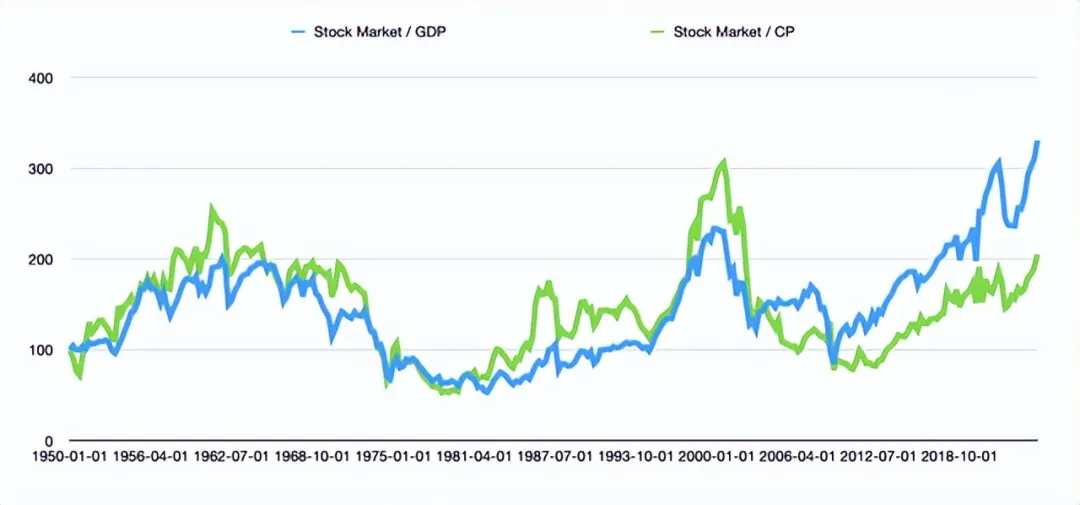
In the above chart, you can see two different Indicators interrelated. The blue line shows the value of the stock market (measured by the S&P 500 Index) divided by USA GDP. Although the Buffett Indicators use the Market Cap of the Wilshire 5000 Index, data on that is hard to come by. Therefore, the Market Cap of the S&P 500 Index is the best substitute that can be reasonably obtained.
This indicator does suggest that the market is at its highest level relative to at least since 1950. However, another line has also been added to it. This is the value of the stock market divided by corporate profits. This indicates that the market price is expensive relative to corporate profits, but it's far less so compared to the market price in relation to GDP. In fact, it is roughly at the same level we saw between 1958 and 1969 over an 11-year span. The gap between it and another line on the chart seems to support the view that GDP may no longer be the best measure of the state of things. The high proportion of corporate income coming from overseas, changes in income structure, and the fact that companies have been able to engage in price gouging during inflationary booms over the past few years may all contribute to this gap.
Ultimately, this indicates that although the stock market is far from cheap, it has not actually exceeded any historical ranges that would signal an impending crash. Along with other positive factors I noted, such as disposable personal income related to credit card debt, rising personal savings rates, and unemployment rates, it is believed that the situation here is net positive.
There are also some signs indicating that future prospects may be better. On average, as interest rates begin to decline, the stock market typically rises significantly. In terms of interest rates, there is also evidence suggesting that we have reason to remain optimistic.
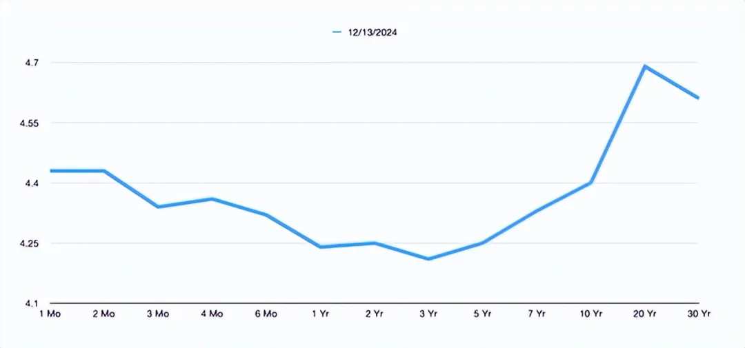
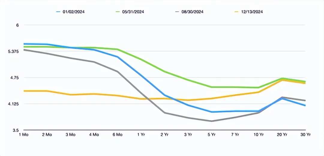
In the above chart, you can see a yield curve inversion of short-term interest rates. But in the chart below, you can see how this situation has changed compared to three other random times I chose earlier this year. Over time, significant changes have occurred. This indicates that the likelihood of a recent recession in the USA is decreasing.
Compared to last year, this year's situation is mixed; last year's data was undoubtedly negative overall. However, when looking at the overall market valuation and other available data, the current net returns for investors are positive. Some believe that the incoming Trump administration may fulfill its promises of regulatory and tax cuts, while others think the short-term impact on the economy could also be very positive. It is necessary to discuss whether this is beneficial for long-term prospects. However, this is beyond the scope of this article.
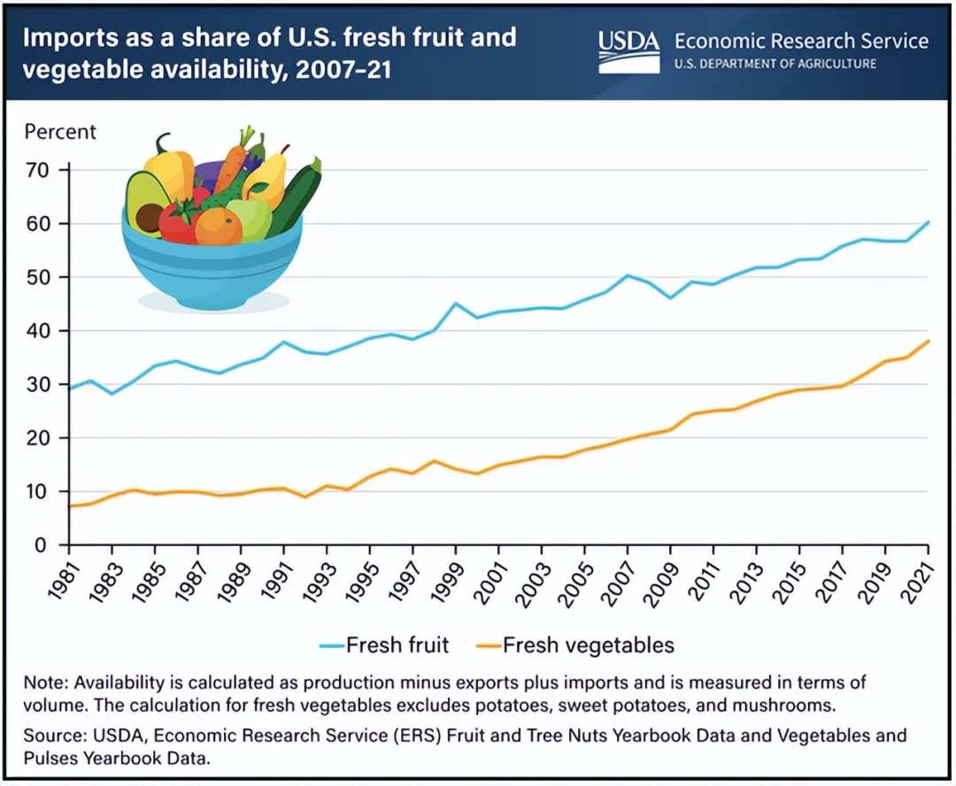
In addition, 60% of the fresh fruits and 38% of the fresh vegetables consumed in the USA come from other countries. In fact, 15% of food comes from overseas. Trade also plays a role in other large areas of the economy. For example, the USA net imports 3.6 million barrels of crude oil from Canada every day, and Trump has promised to impose a 25% tariff on Canada. Mexico is also a major trading partner for the USA and is under the threat of tariffs. In 2023, the total number of light vehicles sold in Mexico by the USA was 3.8 million. This accounted for 19.1% of the USA's new car sales that year. In the first two months of this year, 42.5% of the total autos imported into the USA (including aftermarket parts) came from south of the border.
The market is not as expensive as people imagine, which gives us a net positive effect. Coupled with the positive impacts that continued interest rate cuts, regulatory easing, and tax reductions may bring, the market should see an increase of 10% to 15% next year. If we assume that the S&P 500 Index will be at 6,000 points by the end of this year, then the reading by the end of next year will reach 6,750 points.
Editor/Rocky

 截至本文撰写时,